
Assignment 2 Check-In

 So with this string of shoots, I took advantage of the weather and dragged my roommate out for some photo shoots. (The first shoot of which was her idea). As I already have my four chosen pictures, I thought to share with you all some honorable mentions. 

This first photo was her bright idea of doing an ironic 'snow- swimsuit photo shoot.' at this point in time i had not preset my cameras settings and ended up with a few of these blurry bloopers. this one was my favorite. I edited the photo by heavily increasing the contrast and then adding saturation in hue saturation to the red and blue in her outfit, or lack there of, to make her blurry figure stand out more.


This second photo was created by a specific back-lit set up that was inspired by an article on line, of which I will be linking in the final post for this assignment. I edited this photo by first increasing the lightness of the overall photo. I then went into the photo and burned the bright areas of her chest to keep any distractions from her ghostly movement. Finally, I added magenta to the shadows of the photo and yellow to the highlights.  This, I believe, gave her a more ghostly appearance. This photo did not make the top favorites simply because it was very bright in the chest area, making it a very contrasting photo.

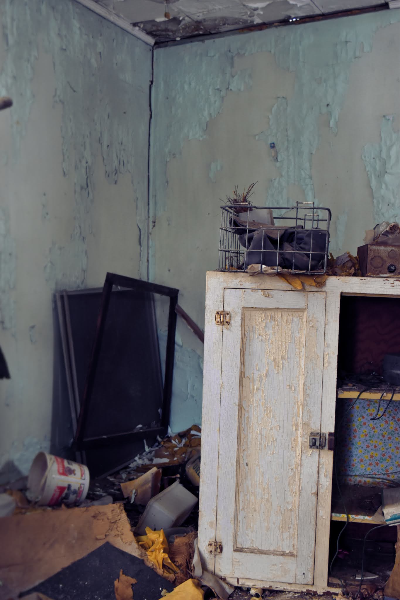
This photo was suppose to represent field of motion. HOWEVER, I do realize the field seems more deep than shallow. my goal was to originally focus on the cabinet before you and get the beautiful decaying walls in the background. when it came time to edit this, I also tried to exaggerate that by increasing the opposing colors (orange and cyan) already present in the photo. While this is one of my favorite photos from this old house, I do not believe it shows depth of field in the way I was hoping for.


This photo, on the other hand, demonstrates a shallow depth of field. showing a crisp tree branch blocking my view Madison. I edited this photo by adding a red saturation on the jacket and a green shadow in color balance. however, this is actually my least favorite photo because it still feels unfinished. This photo I would love to add into the final cut so if anyone has some suggestions for me to try out on this photo feel free to comment them in.


Overall my favorite photo is the second or third photo even though they are the outtakes. I wouldn't be surprised if i found a way to doll them up before Tuesday.

Comments

  1. I like what is happening with these. I enjoy the humor of the first one, but the motion blur feels more like the camera moved rather than the person. The second photograph would be great for this assignment. I agree with your assessment of the third photograph. The effects of DOF just aren't very pronounced. You could zoom out to a wide angle lens and then move in much closer to the cabinet. That might give you the effect you were looking for. The fourth image is also working well. You mention it not feeling "finished". The only suggestion I might make is to increase the warmth of the image in general. Your camera doesn't seem to have adjusted enough for the blue outdoor light. Shift your midtones and highlights slightly toward yellow and/or red, and that might do the trick.

    ReplyDelete

Post a Comment

Popular posts from this blog

The Invisible Man

Above are my attempts at making will invisible. the last photo in particular was hard to pull off as I had to completely copy and paste will onto the background photo to move him around because the two images did not match up.  

Assignment 2: DOF & Motion

  For this assignment, since we were locked in due to the snow, me and my roommate Madison decided to use her as my model in a series of photographs. Here is the result. Depth of Field: With these photos, I experimented with depth of field. In the first Photo my goal was to show a shallow depth of field in showing the detail of the trees and Madison blurry in the background. I edited this photo by adding yellow to the highlights, green to the shadows, and upping the saturation of the red in her jacket. The second photo I tried keeping the depth more mid ranged to deep. Keeping the edge of the building in focus and the sky and trees in blur. I edited this photo by adding brown to the shadows and blue in the highlights. Then I added saturation in red and yellow to bring out the orange in the building.  In this photo however, I wanted the blur to be gradual. starting with a shallow field, my goal was to slowly see the blur increase as it went further into the distance. You can se...

More about the Author

  Hello again! Without no further introduction, here is a little but more about me. I grew up and went to high school in Adamsville Tennessee. I never played any sports, but I was heavily involved with my school's art program. This involved taking 2 semesters past the available art classes as well as organizing a super cool glow in the dark art show. I attended Bethel University originally planning to become a nurse. However, after a couple of tries I realized that it just wasn't for me, and switched my major to art. I now plan to get my master's in fine arts after graduation and hopefully one day teach at NYU. Some things to know about me are that I am a huge Harry Potter fan, Slytherin being my house. I enjoy pretty much any music that is not country, but my favorite artist is probably Russ or Korn. I am currently dabbling in tattoos and would love to get an apprenticeship someday. Lastly, I love to travel; New York and New Orleans are my favorite places to be. If you wou...